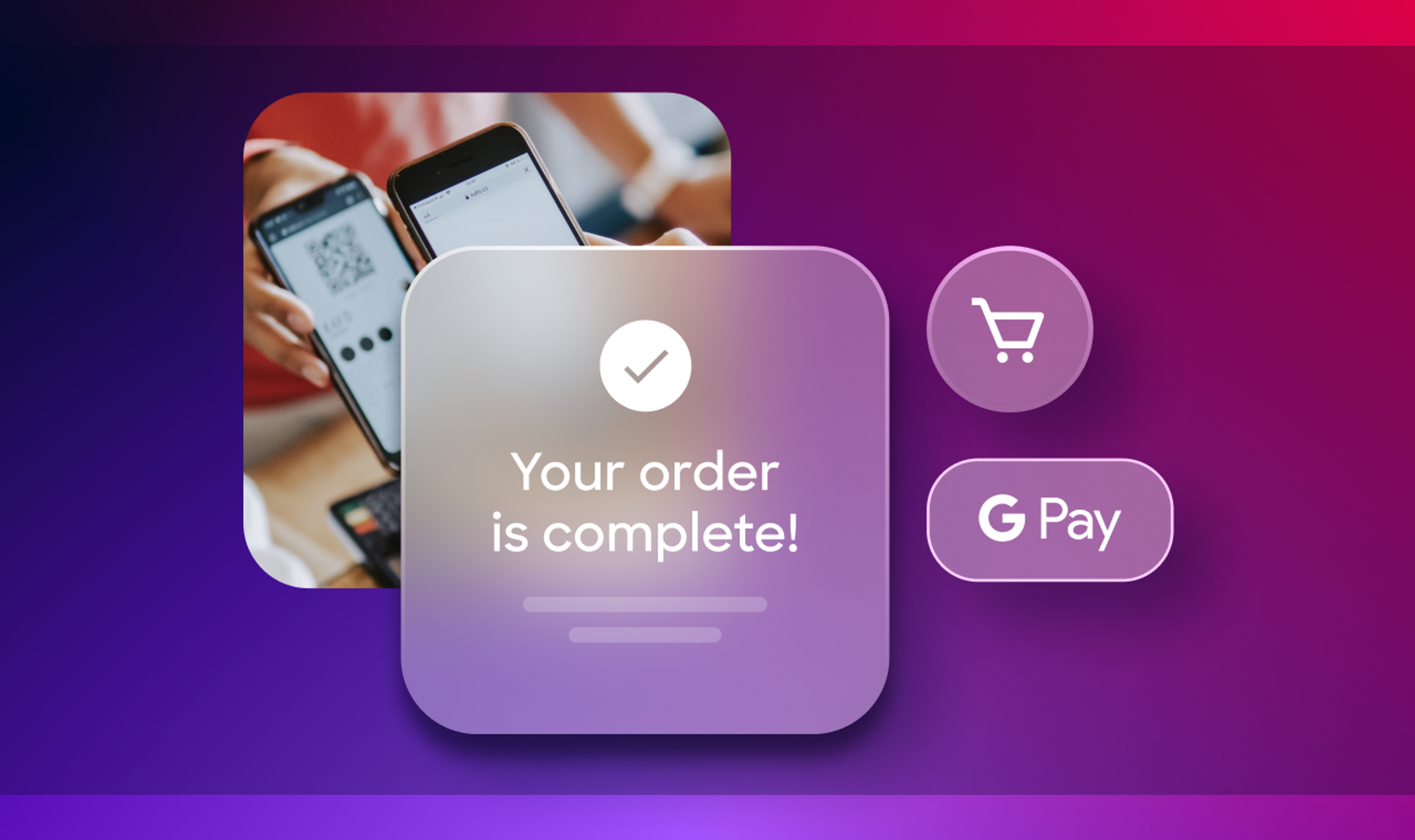
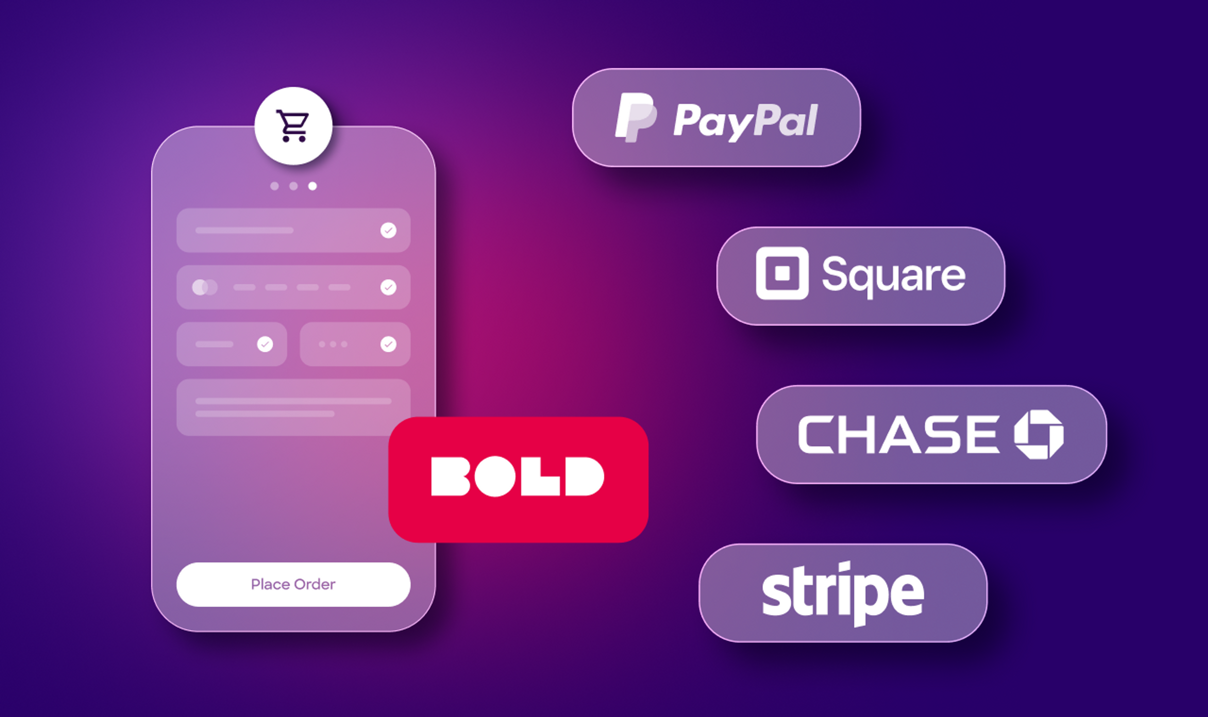
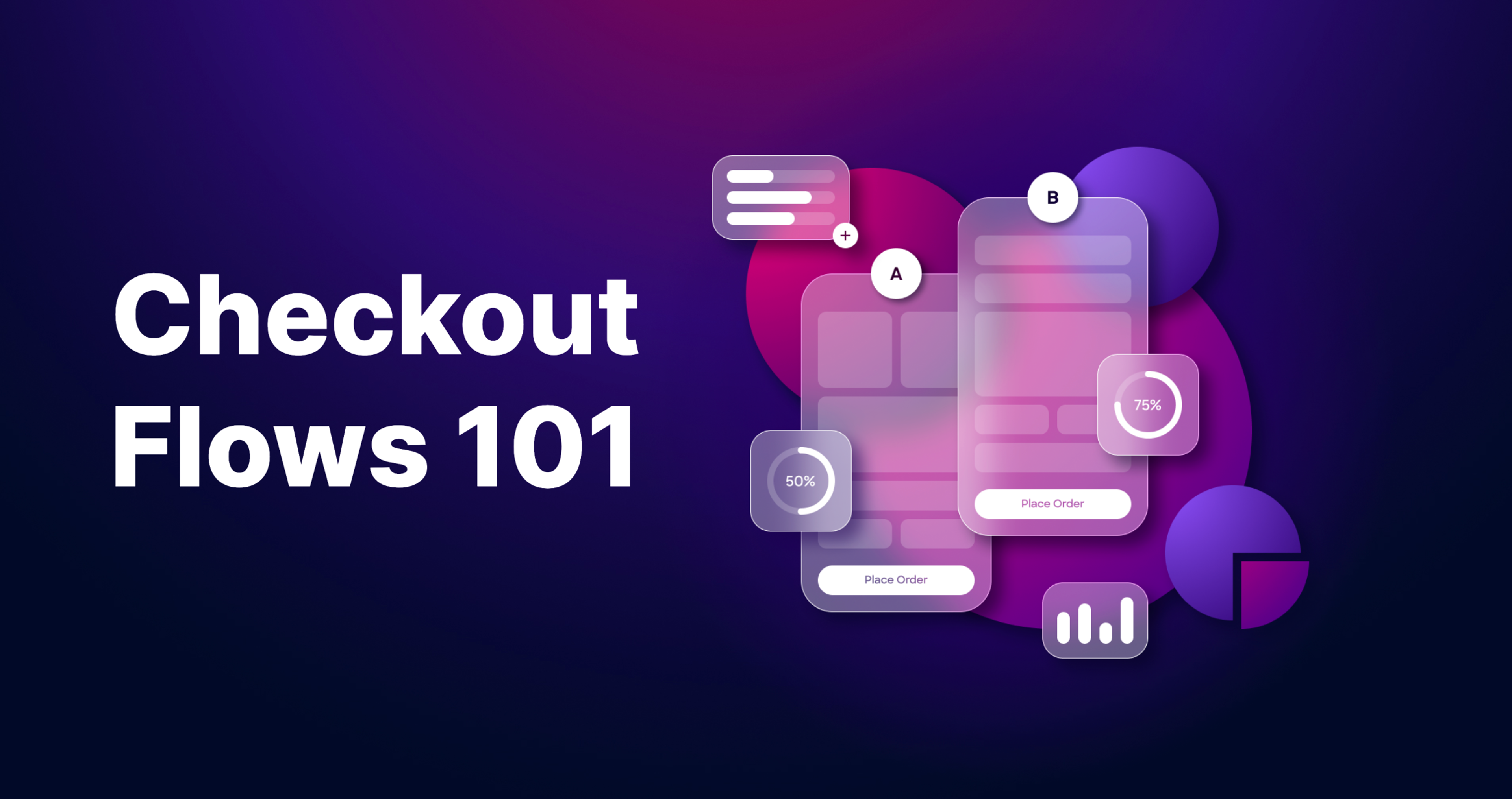
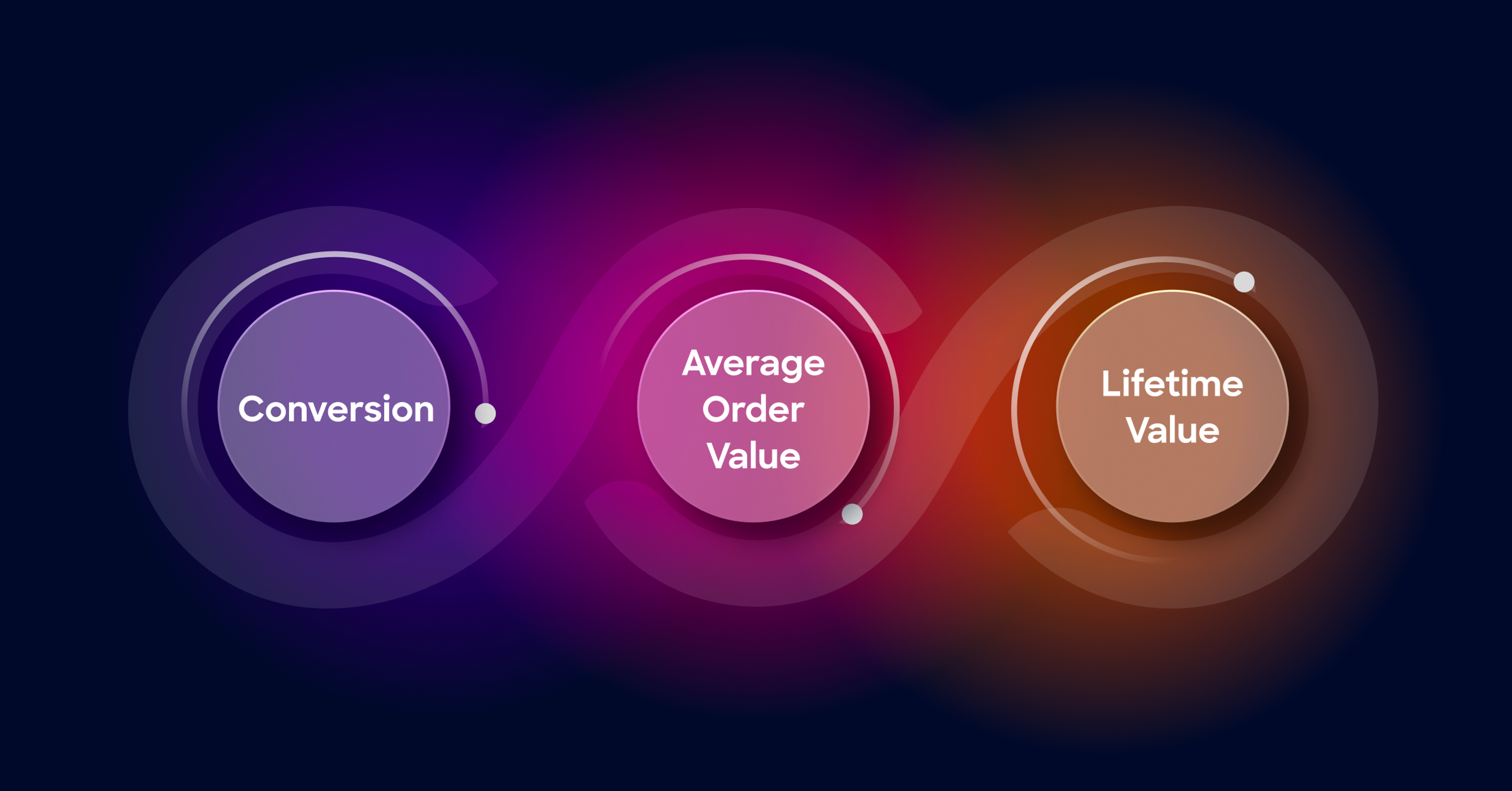
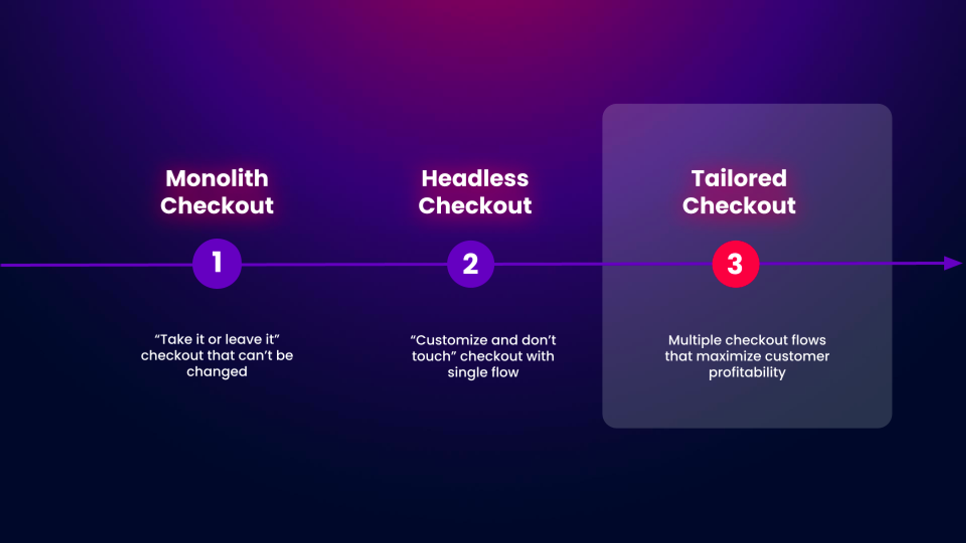
All Posts46Insights17Product9Partners20InsightsBenefits of the headless checkoutApr 12, 2024Anatolli IakimetsDirector, Product MarketingPartnersMACH Alliance: The Checkout MACHathonMar 21, 2024Bold EditorsCopywriterInsightsHeadless Architecture – 5 Benefits to KnowMar 8, 2024Anatolli IakimetsDirector, Product MarketingPartnersMake the Move from Monolith to MACHFeb 21, 2024Jay MyersCo-founderInsightsHow Brands Can Capitalize On Holiday Season 2023 - Learnings and OutcomesFeb 7, 2024Anatolli IakimetsDirector, Product MarketingPartnersWink Biometric Checkout: The Future of Ecomm Authentication and PaymentsJan 12, 2024Ash McGrathSr. CopywriterPartnersEmbracing Innovation: The Bold Journey to Partner EmpowermentJan 5, 2024Ash McGrathSr. CopywriterPartnersEcommerce Predictions for 2024: B2B Evolution, Data Privacy, and Innovative ChannelsJan 2, 2024Ash McGrathSr. CopywriterInsightsUnpacking Meet Magento: Insights and Forward-Thinking with Above the Fray & Bold CommerceDec 15, 2023Ash McGrathSr. CopywriterPartnersBold Commerce and Klarna Integration: Charting New Paths in EcommerceDec 15, 2023Ash McGrathSr. CopywriterPartnersBold Commerce and ClearSale: A Partnership That Reinvents Ecommerce Trust and SecurityDec 8, 2023Ash McGrathSr. CopywriterPartnersPowering Ecommerce Success: How ShipBob and Bold Commerce Forge a Path to Global GrowthNov 7, 2023Bold EditorsCopywriterProductBuy Now, Pay Later: Understanding the Rise of Alternative Payment MethodsOct 16, 2023Nishit RajputProduct Marketing ManagerProductHow to Optimize for AOV with Tailored Checkout Flows Sep 22, 2023Ash McGrathSr. CopywriterProductEffortless Transactions: Best Practices for a Frictionless Payment ProcessesSep 18, 2023Nishit RajputProduct Marketing ManagerInsightsCheckout Optimization: Your Checkout is Wrong for 70% of Your CustomersSep 11, 2023Ash McGrathSr. CopywriterProductChoosing the Right Payment Gateway for Your Ecommerce StoreSep 8, 2023Nishit RajputProduct Marketing ManagerInsightsHeadless vs. Composable Commerce: Which is Right for Your Business?Aug 8, 2023Ash McGrathSr. CopywriterInsightsWhat is MACH architecture and its benefitsAug 3, 2023Anatolli IakimetsDirector, Product MarketingInsightsHeadless vs API-firstAug 3, 2023Anatolli IakimetsDirector, Product MarketingPartnersElevate Your Upsell Game: An Exciting New Partnership with Good Subscriptions UpsellJul 27, 2023Ash McGrathSr. CopywriterPartnersTransform Your Ecommerce Strategy with Checkout UnleashedJul 20, 2023Bold EditorsCopywriterProductBreak Through the Payment Barrier with Payment Gateway BoosterJul 20, 2023Ash McGrathSr. CopywriterPartnersMastering Modern Retail: The ROI-Driven Journey to Composable CommerceJul 7, 2023Ash McGrathSr. CopywriterInsightsCheckout Flows 101: Tailored Experiences For Customer ProfitabilityJun 27, 2023Anatolli IakimetsDirector, Product MarketingInsightsMastering the Metrics: Leverage Checkout Power Trio to Boost RevenueJun 5, 2023Anatolli IakimetsDirector, Product MarketingProductCheckout Evolution: from Gen 1 to Gen 3Jun 1, 2023Anatolli IakimetsDirector, Product MarketingProductImprove security & performance of Magento 1 with Bold’s composable checkoutMar 22, 2023Bold EditorsCopywriterInsightsWhen brands adopt composable commerce, it’s a win-winMar 22, 2023Bold EditorsCopywriterPartnersREVIEWS.io partners with Bold Commerce to empower ecommerce brands with strong social proofFeb 21, 2023Bold EditorsCopywriterPartnersMyTab™ - How to drive more repeat business with revolving creditNov 29, 2022Bold EditorsCopywriterPartnersIntroducing Shoppable Subscriptions in Video!Oct 17, 2022Jay MyersCo-founderProductTime to move from Oracle Commerce to composable commerceOct 12, 2022Bold EditorsCopywriterPartnersOmnichannel retail challenges in the click-and-collect eraSep 14, 2022Bold EditorsCopywriterPartnersUncapped: Empowering founders to go further, faster with easier access to capitalJun 29, 2022Bold EditorsCopywriterPartnersCitcon takes the complexity out of payments for ecommerce growthJun 27, 2022Bold EditorsCopywriterPartnersPeel: How the power of metrics is driving ecommerce successJun 22, 2022Bold EditorsCopywriterPartnersKlaviyo built the leading unified customer platform for ecommerce brands: Email, SMS, personalization and moreMay 12, 2022Bold EditorsCopywriterInsightsEverything you need to know about headless commerce and headless checkout in 2022Mar 15, 2022Nate van der VisDesigner / DeveloperProductSell through new channels with a one-click headless checkoutMar 11, 2022Bold EditorsCopywriterInsightsThe Checkout Benchmark: Data shows retailers can boost conversion with a tailored checkoutMar 7, 2022Bold EditorsCopywriterInsightsHow headless architecture can help solve omnichannel challengesFeb 8, 2022Bold EditorsCopywriterPartnersWhy future-ready brands are embracing the MACH approachJan 31, 2022Bold EditorsCopywriterInsightsHow to close the checkout experience gapDec 13, 2021Bold EditorsCopywriterInsightsHeadless commerce isn’t a trend, it’s expectedJun 3, 2021Bold EditorsCopywriterInsightsAn introduction to headless commerceMay 18, 2021Bold EditorsCopywriter